Optimizing User Engagement
Role
Lead Product Designer
Time
2023 – 2024
Note: All client names and assets have been replaced with generic data for the purposes of this case study.
Description
Goloot's offer carousel revolutionizes standard placement advertising by delivering an interactive experience that rewards users with multiple relevant offers following key engagement moments, such as completing a purchase, creating an account, or reading an article. The carousel is fully responsive and seamlessly integrates into any section of a publisher's website.
Background
In the early days at Goloot, initial conversations with clients led us to understand that our ad units must not distract or compete with existing display ads on their sites. This meant that Goloot’s first ad units required users to select some sort of call-to-action in order to either open up a side panel of offers or view a list of offers in a new tab. Even though these ad units required extra interaction from users, we were able to demonstrate higher levels of user engagement compared to traditional display advertising with our early adopters.
While this was a validating success metric, it was clear that we needed to find a way to boost our volume of impressions in order for us to demonstrate significant value to both our publisher and advertising clients. Fortunately, due to this early success, one of our early publisher clients was willing to allow us to develop a new ad unit that could be displayed somewhere within their articles.
Problem
While our publisher clients were pleased with our engagement rates and wanted to continue to partner with us, some didn’t like that our solution either redirected their traffic to a new page (which didn’t qualify as a conversion), or opened a side panel that sometimes covered their current display ads, impeding on impression-based revenue.
Low conversions due to low volume
Impeding on client impression-based revenue by covering up existing display ads
Redirecting traffic away from the client’s site prior to a conversion
Desired outcome
Generate more conversions by increasing volume
While our engagement rates were good, we needed more volume to boost conversions and drive performance for our clients.
Coexist with traditional display advertising
Nurture and maintain relationships with our publisher clients by developing an ad solution that doesn’t impede on their existing impression-based revenue.
Preserve site traffic as much as possible
With our ad solution supporting several types of campaign pricing models, we should only redirect users from the publisher site for measurable conversions.
Solution
Interactive and customizable carousel of relevant offers
Derive our ad solution into a native, customizable, and engaging carousel that allows users to engage with multiple offers by scrolling horizontally.
Capture leads from the publisher's site
For certain types of ad campaigns, utilize an overlay to capture first-party data from users and display important offer details without redirecting traffic from the publisher site.
Moment-based advertising
Optimize engagement and conversion rates by presenting our ad units to users after certain interactions that have proven to organically increase the user’s attention and receptiveness.
Requirements
Not too large
The first client that was willing to integrate this new in-content solution wanted to replace the newsletter subscription component they were using at the end of their articles with our new ad unit. That said, we needed to try to maintain a similar size to that existing component.
Reuse all of the key elements of our existing ad units
Many clients were still using our early ad units (a separate webpage of offers or an interactive panel of offers).
We needed this new ad unit to essentially reuse all of the key elements so that all of our formats were configured with the same client data.
A unified user experience
As we were designing and building this new in-content ad unit, we were also simultaneously making optimization to the overall user journey of our ad units. It was crucial that our user flow was optimized for:
Different discovery touchpoints
It was important for us to have a seamless and unified flow whether the user was coming from one of our newsletter banner units or discovering our offers directly through the publisher’s site.
Convenience
All offers that required the use of a discount code should have the option to be saved for later by entering an email
Bringing designs to life
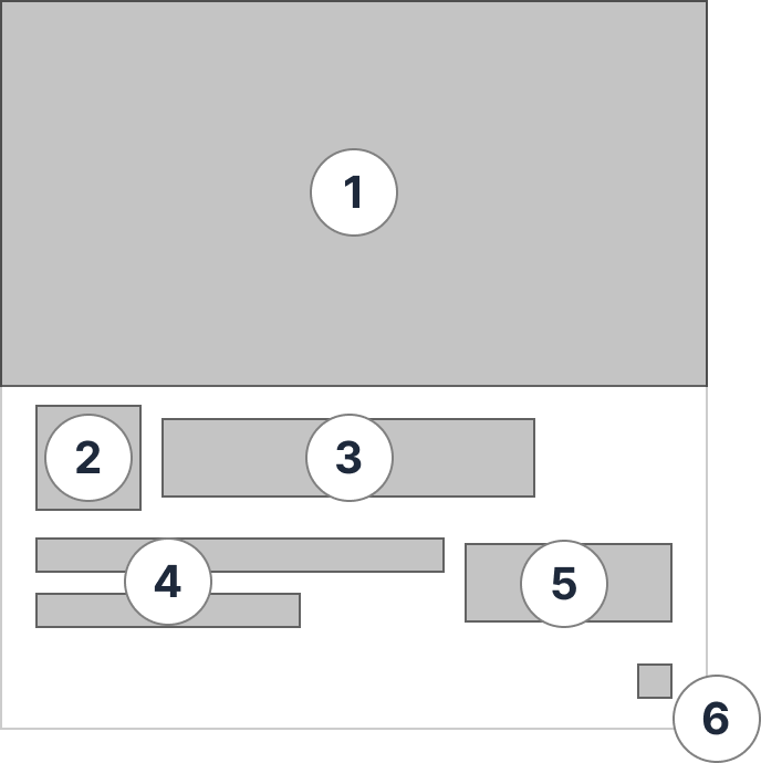
Offer thumbnail
Each campaign that we would run for our advertiser clients would need to be represented within a thumbnail for users to interact with.
Hero image
Brand name
Offer title
Off thumbnail CTA
Ad label

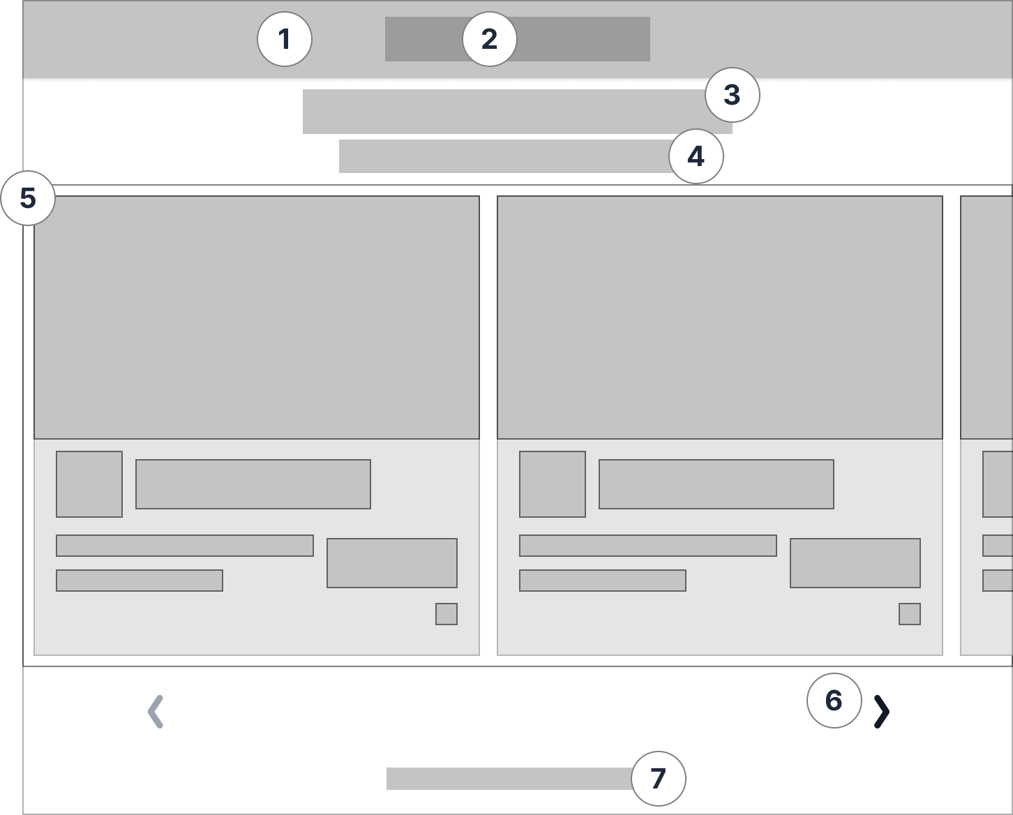
Offer Carousel
The carousel would be an injected iframe that would fill the width of whatever container it’s placed in, while the height would be responsive to its contents. Also, because all of Goloot’s ad units function as white-label solutions for publishers, it was important that it would look, feel, and sound like it was coming directly from the publisher.
Header (customizable background color)
Publisher logo
Publisher header copy (customizable font)
Publisher subheader copy (customizable font)
Interactive carousel of offers
Navigation arrow buttons
3rd party label the redirects to Goloot’s privacy policy

Launch success
The first offer carousel went live in June of 2023 and demonstrated a significant increase in engagement and conversions. It was very well accepted by our clients and quickly became Goloot’s bread and butter product.

Post-launch evolution

Over the course of several months after releasing the first version of our carousel, we:
Introduced a feature that allowed our customer success team to customize the thumbnail button copy
Onboarded more diverse brand partners
Integrated into a wide variety of publisher environments
Each of these elements exposed risks and learnings that needed to be addressed within the design.
Collisions
Now that the Customer Success team was able to customize the button text on the offer tile, there was a much greater risk that the button and the offer title would collide
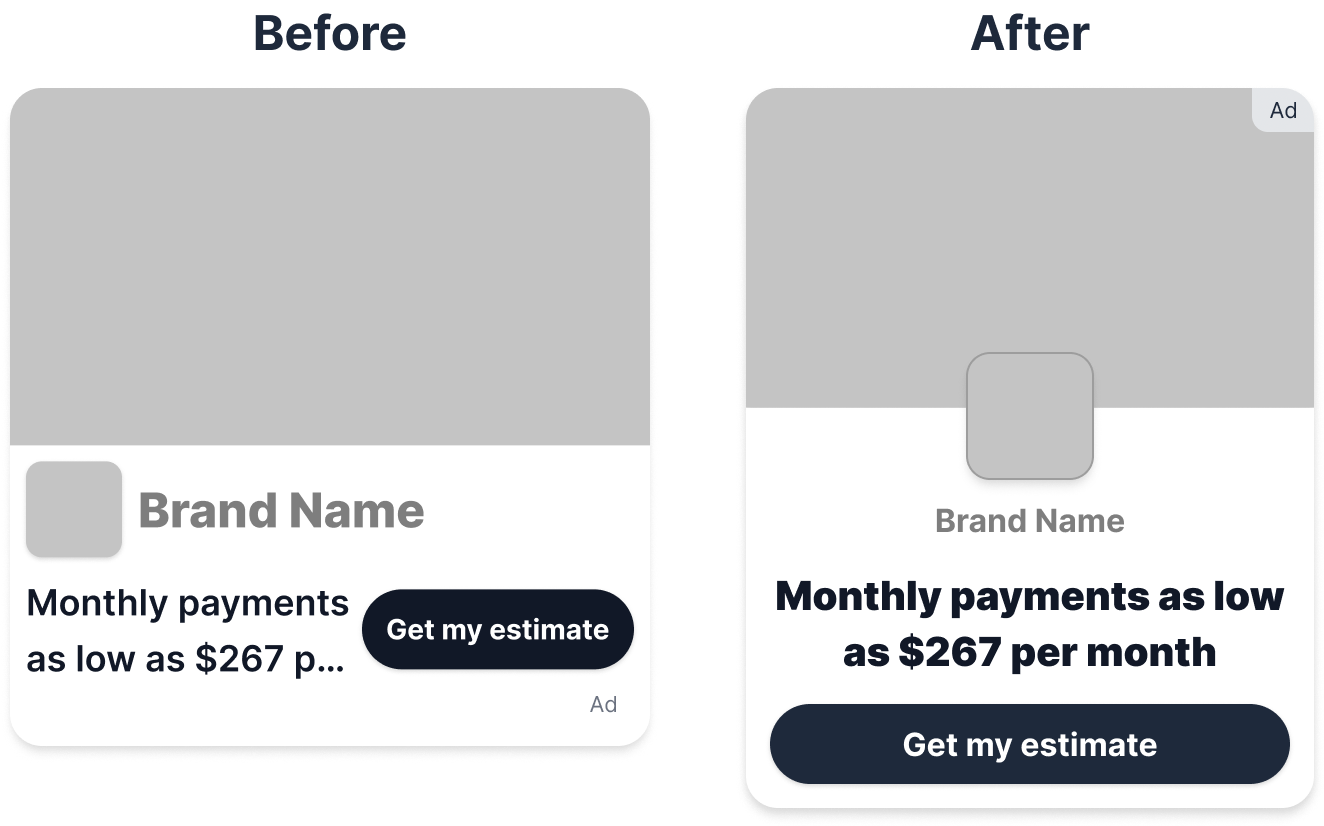
Long brand names
A couple of brand partners insisted on using much longer names than we originally accounted for, leading to the brand name to become truncated within the offer tile.

Small spaces
As our product was adopted by more publisher clients, we sometimes witnessed our offer carousel being integrated into 300-pixel-wide containers, via the side-rail of a desktop site, or a media query on mobile devices that we couldn’t override. With the width of our offer tile being larger than 300px, this constraint caused the design of the offer carousel to break.

Conclusion
Since the release of the carousel, Goloot has continued to observe a steady increase in growth each quarter. It was a pivotal moment in generating internal alignment towards Goloot’s strategy and goals, as well as providing a solid foundation of learnings for future initiatives and formats.