Ballistic
A marketplace for the modern gamer.
Role: Lead Designer
Tools: draw.io | Marvel | Figma | Sketch
Product summary
As the video game industry continues to flourish and target an exponentially increasing adult market, video game users need an all-in-one mobile marketplace app to fulfill their diverse gaming needs. Ballistic enables users to learn more about the video game industry, customize their preferences, and download games to various platform accounts easily.
Getting up to speed
Shortly after the US declared Covid-19 to be a public health emergency, I read that Italy had experienced an increase of more than 70% in internet traffic with the primary contribution being from online games such as Fortnite and Call of Duty. This inspired me to do a little research. I discovered that the video game industry had reached an all-time high since the Covid-19 lockdown. In the US, the gaming internet traffic went up 75% and the video game streaming service Twitch experienced a 20% increase in consumed content. As someone who barely plays video games, I found this to be an interesting market to explore.
Problem – The struggle is real
Through some initial interviews with several avid game lovers, I was able to determine a few common frustrations:
It’s difficult to discover and learn about games a person may enjoy based on their preferences.
Gaming news apps for mobile devices are cumbersome and not properly marketed to their target audience.
It’s inconvenient and time-consuming for multi-platform game lovers to browse and download games on various marketplace apps.
Vision – Crafting the solution
After having those initial conversations, I was able to narrow down my vision to three simple goals:
Design a mobile app that enables users to discover and download games to a specific account or device.
Design a mobile app that enables users to read articles related to games and the industry.
By using Apple’s Human Interface Guidelines, design a mobile app that is aesthetically pleasing and engaging for target users.
Pre-survey research
Prior to creating my own user survey, I did some market research to help paint a picture of who the target audience is.

The majority of gamers in the US are between the ages of 18 and 35.

75% of households in the US have at least one gamer.

65% of all adults in the US play video games.
User survey – Gathering data
While it was important to find out what types of games game-lovers were using and what competing apps they were engaging with, the main goal of the survey was to determine potential user stories for the app. To do this, I asked 40 game-loving participants to rate the importance of twelve potential features on a scale of 1 to 5. Here were the six top-rated features:
Competitive analysis
Based on my interviews, market research, and user survey, it was clear that the three main mobile platforms worth analyzing were Steam, IGN, and Apple Arcade. While I did a thorough competitive analysis of each of these platforms, here is a comprehensive SWOT analysis of each application.

Steam
Top digital video game distribution service
Strength:
Massive game library enabling users to browse and purchase games
Weakness:
Weak mobile interface with navigation and accessibility issues
Opportunity:
Improve navigation and overall user experience
Threat:
Marketplace that caters to various platforms aside from just PC games

IGN
Top mobile app for video game news
Strength:
Read and save articles related to the gaming industry
Weakness:
Distracting and intrusive ads that clutter the interface
Opportunity:
Explore income streams that do not interfere with the user experience
Threat:
News app with a marketplace to provide sustainable income

Apple Arcade
Top marketplace for mobile games
Strength:
Clean interface with no ads or microtransactions
Weakness:
Weak game selection with no AAA games
Opportunity:
Expand catalog with more well-known franchises
Threat:
Mobile marketplace with prominent titles for iOS and other platforms
Personas – Who are these people?
After reviewing notes from my interviews and survey results, I was able to determine two key users based on behavior, motivation, and demographics:
Casual users: The primary goal of a casual user is find interesting and relevant content. They are frequently visiting the app and are engaging with new and trending content.
Goal-driven users: Aside from browsing and purchasing games, goal-driven users are motivated to use the app to find specific information such as game strategies, reviews, and suggestions based on previously purchased games.
Goals:
• Find new games related to her preferences
• Read about trending topics
Frustrations:
• Filtering through non-gaming content
• Dealing with intrusive advertisements
Goals:
• Read game reviews and strategy tips
• Stay informed about specific games
Frustrations:
• Dealing with poor search engine results
• Clunky usability with apps on the market
Stories & flows – The MVP
After gathering this research on the market, it was time for me to start defining the scope and develop the minimum viable product. I narrowed down a list of user stories and organized them by high, medium, and low-priority features. From here, using Draw.io, I created user flows that visually captured the necessary steps involved with completing each individual user story.
High priority
Onboarding
Search and browse games
Purchase and download games
Medium priority
Read game reviews and ratings
Read articles and trending news
View game suggestions
Low priority
Bookmark articles
Add games to a wishlist
Wireframes – Piecing it together
After creating some rough sketches to assist with the basic structure and layout of the content, I imported my concepts into Figma to create some low-fidelity wireframes. I proceeded to create iterations on my ideas until I was happy with the basic structure of the app.

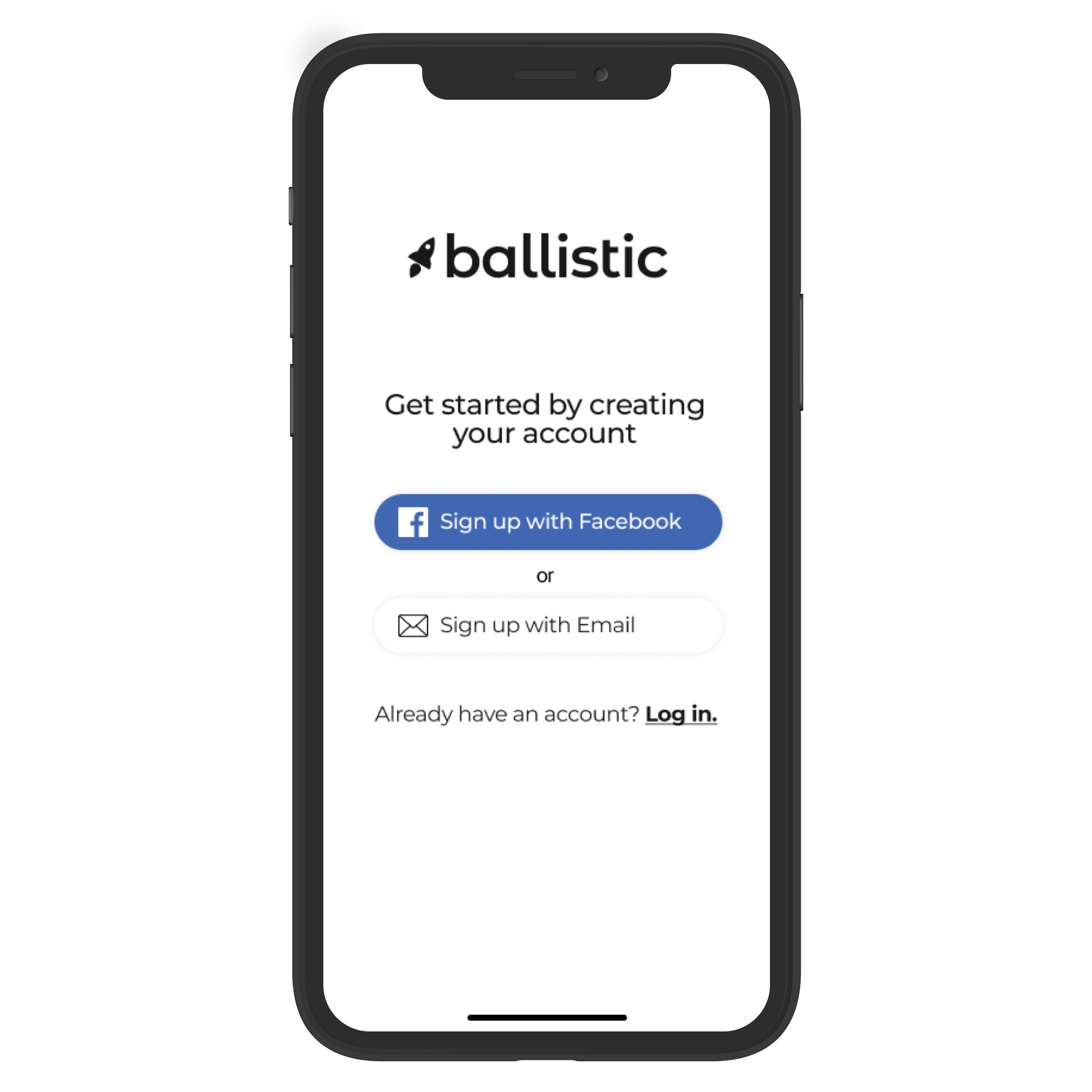
Welcome page

Create account

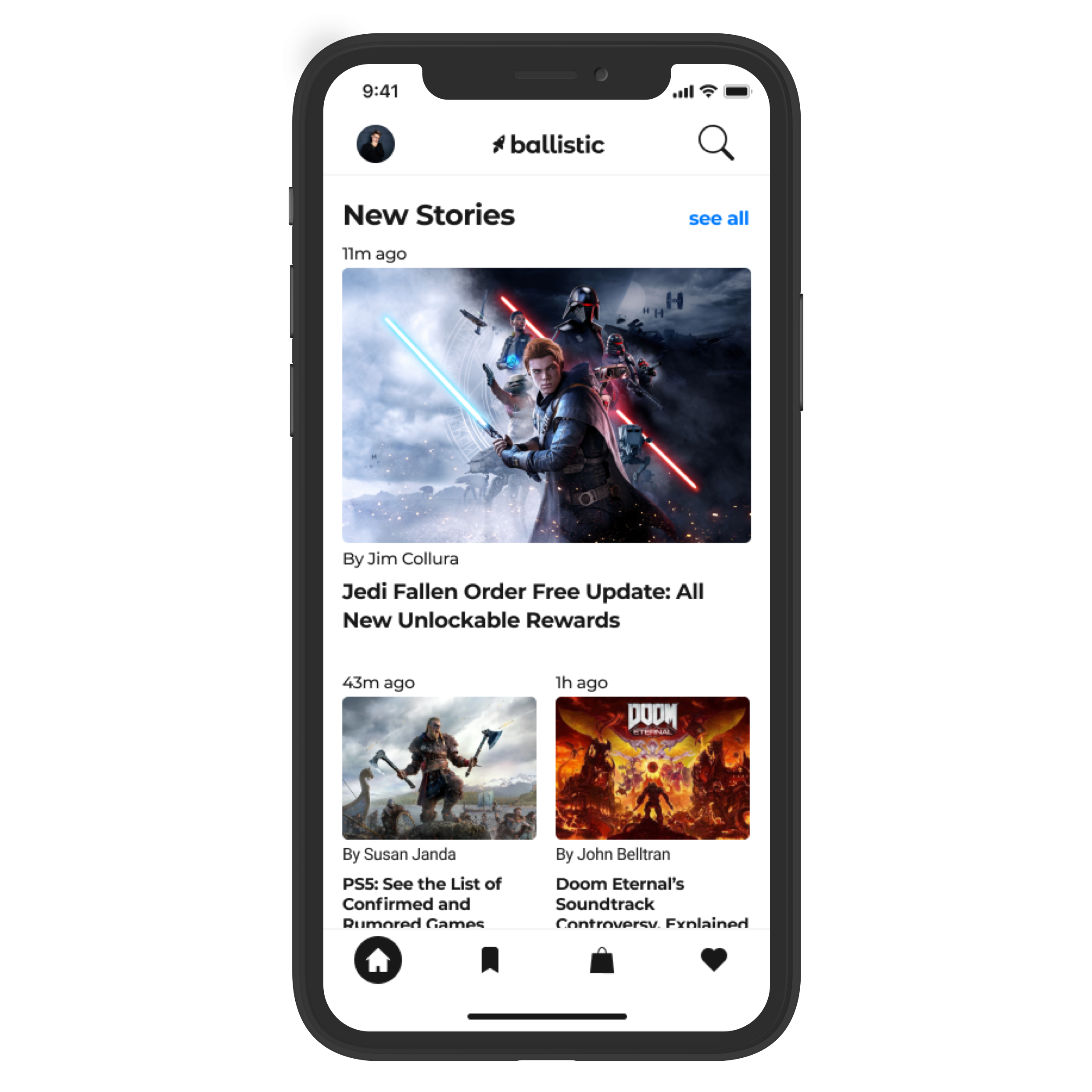
Home / News page

Store page

Single game

Checkout
Usability testing – Round 1
Using Figma’s built-in prototyping tool, I made my wireframes clickable so I could test the usability of my user flows. With three potential users, I tested their ability to:
Create a new account
Search for a game
Locate the reviews for the game
Purchase the game
Save an article to their saved stories
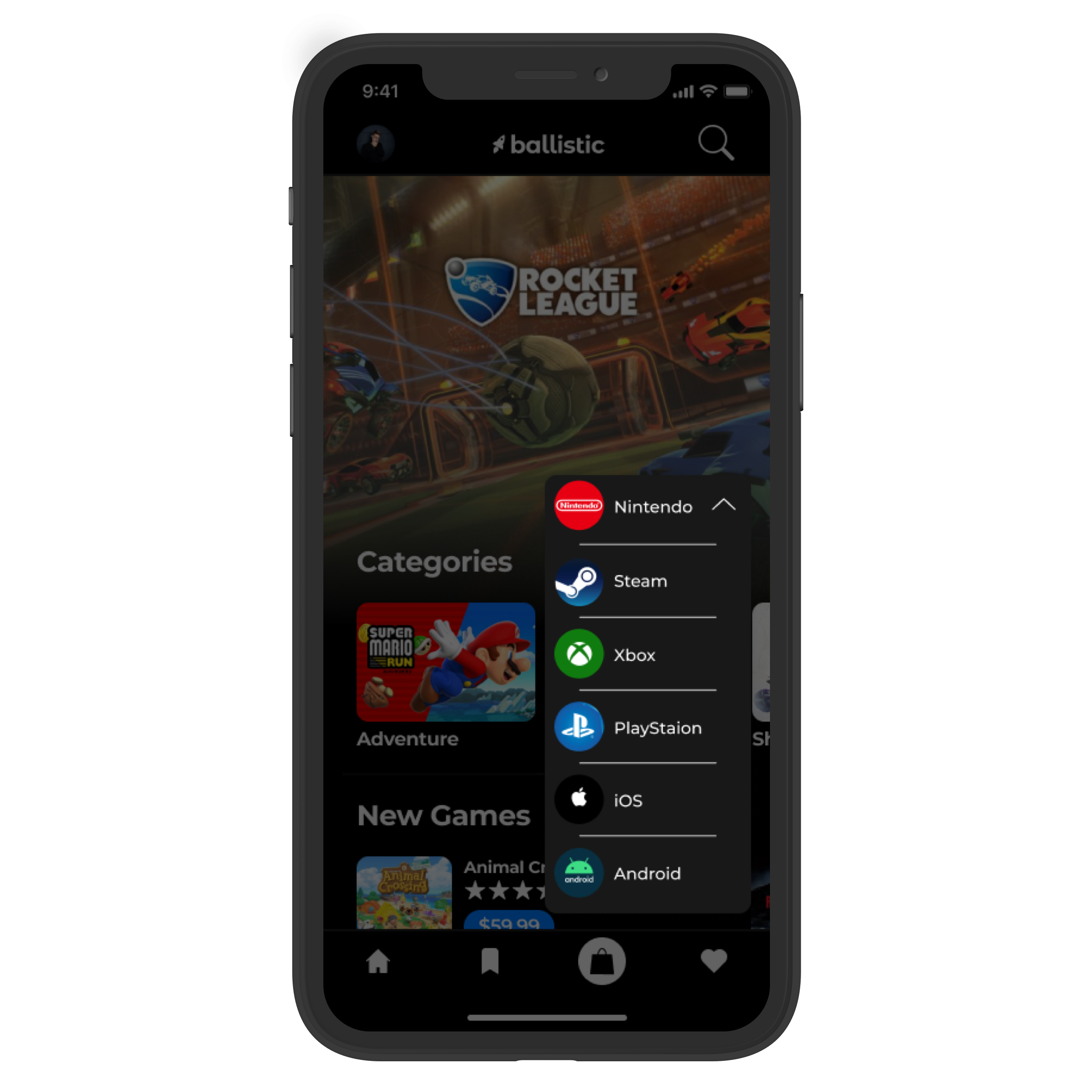
While none of the participants struggled with these basic tasks, there was one thing that didn’t provide as much value as I originally thought it would. This was the feature that allowed users to change which platform they were shopping for on the store page. The horizontal scrolling for this feature seemed to be more cumbersome than convenient and I determined that a simple drop-down menu would remedy this issue by defaulting to the users’ interests.

Before

After

This realization encouraged me to add a simple step to the onboarding process that would enable users to indicate their gaming preferences. By enabling the user to personalize their interests, this would improve the value and overall engagement of the app.
Branding – Content conscious
In order to confidently define the branding for this app, it was essential for me to get an idea of what the content would look like. Because I knew that the content was going to be very stimulating and engaging, I knew that if I wasn’t careful, the app could end up looking like the Disney channel on an LSD trip. I wanted the app to be a neutral canvas that doesn’t distract, but instead compliment the engaging content.


Branding – Color palette
The loud content led me to be inspired by apps like the Apple App store, Medium, Apple News, and Spotify. This is where I found validation in creating a white and black, light and dark mode themed app. After trying variations of light and dark mode, I determined that for maximum legibility and comfort, light mode should incorporate a pure white background with off-black text. Conversely, dark mode should incorporate a pure black background with off-white text.
Branding – Logo
After locking down the name Ballistic, I explored various logo ideas. The logo needed to be:
Playful, but not silly
Engaging, but not loud
Clean, but not cold
Branding – Fonts
For the main logo font, I decided to use Montserrat Alternates. I found that it captured the energy that was in line with the branding goals. I loved the roundness of the letters and particularly appreciated the shape of the a, l, and i in the name Ballistic.
Regarding the font for the main content of the app, I chose Montserrat. It’s clean and professional while it’s extra wide y-axis contributes to its legibility and audience engagement.
Montserrat Alternates


Montserrat


High-fidelity mockups
Now that I had the visual characteristics defined, I created the first iteration of high-fidelity mockups. Once I felt I had a solid foundation, I was eager to conduct my second round of usability testing.

Home

Profile drawer

Store

Platform drop-down

Game info

Checkout
Usability testing – Round 2
Again, using Figma’s built-in prototyping feature, I turned my screens into a high fidelity clickable prototype. With three new game-loving participants, I tested their ability to:
Create a new account
Search for a game
Locate the reviews for the game
Purchase the game
Save an article to their saved stories
Given that participants were able to complete these tasks from my wireframe testing easily, I had four main goals for this second round of testing.

Impression
I wanted to test the user’s overall impression of the app. Do they find it unique, intuitive, and valuable?

Tab bar icons
During the test I asked participants to predict and explain what they thought each icon indicated.

Drop-down menu
I wanted to know if the drop-down menu on the store page was discoverable and intuitive.

Anything missing?
Lastly, I wanted to know if participants felt that anything was missing or out of place.
What went well?

Impression
Once again, users were able to complete all of the user flow tasks with ease, but most importantly, that participants fount the app to be engaging, the content to be relevant, and the solution to be valuable.

Drop-down menu
The drop-down menu on the store page was a huge success. Participants pointed it out on their own without any prodding and immediately identified its unique value.
What failed?
The joystick icon in the tab bar was a huge failure. While I wanted to do something fun and unique to indicate the game marketplace, it was immediately clear that I had taken it too far and needed to utilize a standard icon commonly associated with shopping. I was inspired by Nintendo’s interface to use a shopping bag icon.

Before

After
What was missing?
It became clear to me during this round of testing that users should be able to purchase a game without having to select the game. The purchase button needed to be underneath the title of the game in the marketplace. Additionally, all participants indicated that they would expect to see the game’s rating without having to select the game.

Before

After
Final product
Light Mode


Dark Mode


Conclusion
Through my research and design process, I feel I was able to successfully craft a solution that empowers target users to accomplish their goals:
Purchase and download games for various gaming platforms
Discover new games based on the user’s preferences
Read relevant articles related to the gaming industry
View game ratings and reviews
This project taught me the importance of leaning on established design patterns. In order to recruit users, it’s important to understand what they anticipate based on their past experiences.